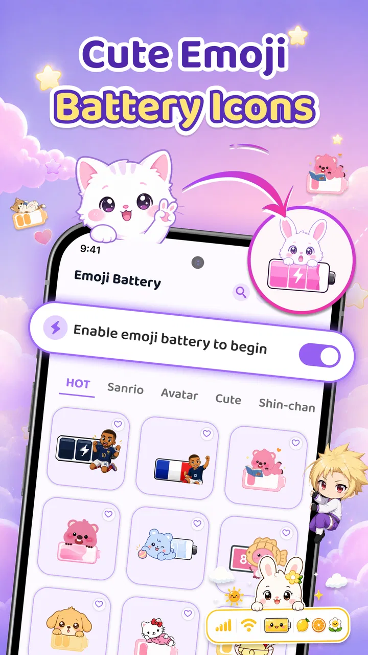
Emoji Battery Widget & Icons
- 4.4
- Rating
- 1.00M
- Installs
- Free
- Price

 Analysis by App-foxy
I noticed Emoji Battery Widget & Icons because it takes a small, usually forgettable part of the phone and turns it into something more personal. Instead of treating the battery indicator as a purely functional symbol, the app focuses on emoji-style battery visuals, screen pets, and charging effects. That makes it a personalization app first, rather than a replacement for the phone’s settings or a serious battery-monitoring tool.
My first impression is that it is aimed at people who enjoy changing the mood of their home screen without having to redesign the entire phone. The idea is simple: give the battery area more character, add a playful companion to the screen, and make charging feel less ordinary. It will not appeal equally to everyone, but for someone who likes expressive icons and small visual details, it offers an easy way to make a familiar device feel more individual.
What to expect before you begin
The app is free to install, with optional in-app purchases ranging from $2.99 to $19.99 per item. That distinction matters because the basic download is easy to try, while some of the more decorative choices may sit behind optional purchases. I would approach it as a customization playground rather than assuming every visual element is included immediately.
You May Also Like

 Blood Strike: 2.5 Anniversary
Blood Strike’s Loadouts Turn Every Drop Into a Tactical Gamble
A close look at Blood Strike’s custom loadouts: how fast access to signature weapons reshapes its battle royale rhythm, rewards preparation, and narrows the gap between fights.

 Pandora - Music & Podcasts
Pandora’s Music Is Easy to Start, but Harder to Recover
Pandora’s strength is its low-effort path from a seed to a station. Its weak spot is how much confidence it asks you to place in connection, setup, and quiet recovery.

 8 Ball Pool
 Is Built on Rivalries, Rematches, and Routine
A close look at the rivalries, rematches, shared routines, and unanswered safety questions that turn a quick pool match into a persistent mobile community.

 Samsung Music
’s Quiet Strength Is Playing What You Already Own
Its reach comes less from spectacle than from dependable access to a personal library. That simplicity is both the app’s strongest retention engine and its ceiling.

 AccuWeather: Weather Radar
AccuWeather Review: A Quick, Clear Forecast for Everyday Decisions
For everyday plans, the best forecast is the one you can understand quickly. AccuWeather makes rain timing, radar, and local conditions easy to act on, with a few trade-offs.

 Hill Climb Racing
Why Hill Climb Racing Still Turns Crashes Into One More Run
A tiny car, a bumpy hill and one more upgrade: Hill Climb Racing keeps resurfacing because its simple chaos makes every near-miss feel personal.
More From Our News Desk



It comes from Tools for Everyday - AI Tasks and has reached over one million installs, with a 4.4 average from around 57 thousand ratings. Those figures suggest that the concept has found a sizeable audience, but they do not change the practical question: do you actually want a more playful battery display? If you prefer a quiet, minimal interface, the extra decoration may feel unnecessary after the initial novelty.
The app is suitable for Everyone, and it runs on Android 8.0 or later. Its current version is 1.0.4, so I would still keep expectations realistic about how it fits into different phone launchers and home-screen layouts. Android manufacturers handle widgets and background visuals differently, and a personalization app can feel slightly different depending on the device.
One useful way to think about it is as a layer placed over your existing phone experience. Your normal battery controls remain important for accuracy and system management. This app is there to make that information more visually appealing and to add personality around it. It is best used as a visual companion to the system battery indicator, not as a substitute for it.
Who will enjoy the concept most
I can see this working especially well for people who regularly change wallpapers, icons, widgets, or lock-screen styles. It also suits users who like a themed phone but do not want to spend an hour rebuilding every screen. A battery emoji or small screen pet can provide a noticeable change without requiring a complete visual overhaul.
It is also a nice fit for a second phone, a family device, or a handset used by someone who enjoys friendly visual cues. A playful battery treatment can make charging status easier to notice at a glance, especially for people who find tiny conventional indicators easy to overlook. That is not the same as improving battery life, but it can improve awareness.
I would be less enthusiastic about recommending it to someone who wants precise battery statistics, charging health information, temperature readings, or detailed usage charts. The app’s appeal is expression and atmosphere. If your priority is diagnosing battery drain, Android’s built-in battery page or a dedicated monitoring utility will usually be the more sensible choice.
Getting from installation to a useful first result
I’d begin by making a single battery-style change and checking that it stays easy to read on your usual home screen; that gives you a useful first result without cluttering the layout. Once you know that visual treatment suits your routine, you can decide whether a screen pet or charging effect adds something you’ll enjoy day to day.
Start with one change, not the whole collection
For a first-time user, I recommend resisting the temptation to explore every visual option immediately. Begin with the battery element, because it gives you the clearest sense of whether the app belongs on your phone. Choose a style that remains readable at a glance, place it where your thumb or eyes naturally pass, and then use the phone normally for a while.
This approach avoids a common personalization mistake: creating a busy home screen before deciding whether the central feature is genuinely useful. The most successful setup is not necessarily the most colorful one. I found that a simple emoji treatment can work better than several competing decorations, particularly on a small display or a wallpaper with lots of detail.
When positioning a widget or visual element, leave enough breathing room around it. Crowding it beside weather, calendar, music, and social widgets can make the battery information harder to find. The app is more effective when its playful design still preserves a quick visual hierarchy. A cute battery that disappears into a crowded screen has lost much of its practical value.
Make the first successful action deliberately simple
The first meaningful success should be seeing the chosen battery style in a place where you can understand it immediately. I suggest checking the home screen after setup, then briefly comparing what you see with the phone’s regular battery indicator. That small comparison helps you learn what the app is communicating and prevents confusion later if the decorative display looks different from the system icon.
A realistic everyday scenario is checking your phone before leaving home. Instead of opening settings, you glance at the customized battery indicator while checking messages or directions. If the visual is clear, you know whether charging is worth doing before you go. Later, when you connect the charger, the charging effect gives that routine a more noticeable visual response.
That is where the app makes the most sense to me. It does not transform charging into a new utility, but it gives a repetitive moment a little more feedback. The benefit is small and personal rather than technical. For users who enjoy that kind of detail, small benefits can be enough to keep a customization installed.
Use screen pets as atmosphere rather than information
The screen-pet idea serves a different purpose from the battery display. I would treat it as a decorative companion, not something that should carry important information. Place it where it adds character without covering controls, text, or shortcuts. If you use the phone for work, navigation, or reading, a restrained placement will probably feel better than putting visual activity everywhere.
There is a useful trade-off here. A screen pet can make the phone feel warmer and more personal, but it can also become visual noise if you already use a busy wallpaper or several animated elements. I recommend pairing it with a simpler background and limiting the number of other decorative components. That gives the pet room to be noticed without making the screen feel cluttered.
This is also a good reason to test the app during an ordinary day rather than judging it only during setup. A design that looks charming for five minutes may feel distracting when you are trying to read a long message. Personalization is successful when it survives daily use, not merely when it looks impressive in a preview.
Charging effects need the right expectations
Charging effects are the most immediately theatrical part of the experience. They can make the moment of plugging in the phone feel more deliberate, especially if you usually charge while working, relaxing, or getting ready for bed. I like the idea as a small visual ritual, but I would not confuse animation with faster charging or improved battery health.
If you charge overnight, a strong effect may be enjoyable at first and then become unnecessary. If you often connect the phone briefly during the day, the visual response may feel more worthwhile because it confirms the action in a memorable way. The best choice depends on how often you charge and whether you prefer quiet or expressive feedback.
One practical tip is to keep the charging presentation consistent with the rest of your phone. A cheerful effect paired with a subdued home screen can feel intentional; several unrelated styles can make the device look assembled rather than designed. I would choose one theme direction and adjust the surrounding wallpaper or icons to support it, instead of treating every available option as something that must be enabled.
Common confusion around widgets and phone behavior
The biggest point of confusion is likely to be the difference between personalization and system control. A custom battery display may show battery status in a friendlier form, but the phone’s own battery system remains the authority for power-saving decisions, charging behavior, and device health. If the two visual indicators appear slightly different at a particular moment, check the system indicator before drawing conclusions.
Home-screen placement can also vary by launcher. Some Android phones make adding widgets straightforward, while others use a long press, a dedicated widget panel, or a manufacturer-specific layout. That variation is not unique to this app, but it can make the first setup feel less direct. If the visual does not appear where expected, I would first check the home-screen widget menu rather than repeatedly reinstalling the app.
Another source of friction is screen density. An emoji or pet that looks balanced on one phone may occupy more space on another. Resize or reposition the element if your launcher allows it, and judge it from the distance at which you normally use the phone. A design that is technically visible but too small to recognize is not doing much for you.
It is also worth remembering that decorative elements compete with readability. Bright charging visuals may look good against a dark background but lose contrast on a light one. Likewise, an expressive battery icon can be less immediately understandable than the familiar system symbol. If you need instant clarity, choose the simplest available visual treatment and keep the standard battery indicator easy to access.
Where the app is stronger than ordinary alternatives
Compared with leaving the standard battery icon untouched, this app offers a more expressive result with less effort than a full custom launcher setup. You do not need to redesign every app icon just to give the battery area a different personality. That focused approach is its strongest advantage: it targets a small part of the interface and makes it feel more intentional.
Compared with a conventional battery-monitoring app, however, its priorities are different. A monitoring tool is usually the better choice when you want charts, consumption breakdowns, or troubleshooting information. Here, the value comes from visual feedback, screen companions, and charging presentation. Choosing between them depends on whether you are trying to understand the battery or simply enjoy seeing it represented differently.
It also sits between a static wallpaper and a full theme pack. A wallpaper changes the background but may not affect how you interact with the phone. A complete theme can be more comprehensive but may require more setup and can alter many familiar controls. This app offers a smaller commitment. You can experiment with one visual element and remove it if it does not suit your routine.
Three details that make the experience work better
First, design around visibility rather than decoration alone. Place the battery element near a natural glance point, but avoid the top corner if your wallpaper already has bright detail there. Contrast and spacing matter more than choosing the most elaborate emoji. This is the difference between a customization you notice once and one that remains useful every day.
Second, separate novelty testing from long-term setup. Try a lively screen pet or charging effect briefly, then spend a normal day with it. If you find yourself ignoring it, simplify the arrangement instead of adding more. The app rewards selective use; enabling every visual option can hide the one feature you actually enjoy.
Third, use the app to create a theme around a routine. For example, a calm battery style and a quiet charging effect may suit a bedtime setup, while a brighter arrangement can fit a personal phone used throughout the day. Thinking in routines makes the customization feel purposeful and helps you decide which elements deserve space.
What may limit its appeal
The app’s main limitation is that its benefits are subjective. It can make the phone more fun, but it will not improve the underlying battery, extend runtime, or replace Android’s power controls. If you are looking for measurable technical gains, the decorative approach may feel shallow.
There is also a risk of visual fatigue. Battery icons, pets, and charging effects are attention-grabbing by design, and that can become tiring for users who prefer a clean interface. The free entry point makes experimentation easy, but optional purchases mean you should decide whether the extra styles are worth paying for before building your entire phone aesthetic around them.
Finally, personalization can be affected by the phone itself. Launcher behavior, screen size, and the way a manufacturer handles home-screen elements may influence how polished the result feels. That does not make the app unusable, but it means the same setup may require more adjustment on one device than another.
My recommendation for the next step
I would recommend trying it if you want a low-commitment way to make your Android phone feel more playful. Start with one battery visual, confirm that it remains readable, and only then experiment with a screen pet or charging effect. That path gives you a clear first success without turning the setup into a decoration project.
I would skip it if your main goal is battery diagnosis, strict minimalism, or deeper control over charging behavior. In those cases, the built-in Android tools or a purpose-built battery utility are more appropriate. The app is not competing on technical depth; it is competing on charm and immediacy.
For me, the strongest use is a carefully limited arrangement: one clear battery treatment, a screen pet placed away from important controls, and a charging effect that matches the phone’s overall mood. Used that way, it adds personality without taking over the interface. The best result comes from making the phone feel more like yours while keeping the information easy to understand.
With its free starting point, Everyone rating, and support for Android 8.0 or later, it is accessible to a broad range of users. The optional purchases are worth considering only after you know you enjoy the basic idea. If you like small visual changes that make everyday routines feel less mechanical, Emoji Battery Widget & Icons is an appealing, focused choice rather than an all-purpose customization system.
FAQs for Emoji Battery Widget & Icons
01What is Emoji Battery Widget & Icons, and what does it do?
Emoji Battery Widget & Icons is a customization app designed to make your device’s battery information more expressive and visually appealing. It can provide emoji-themed battery widgets and icon styles that show the current charge level on your home screen or status area. Depending on your device and operating system, some features may require adding widgets manually or enabling specific permissions.
02Is Emoji Battery Widget & Icons compatible with both Android and iPhone?
Compatibility depends on the version of the app and the operating system running on your device. Android users may receive broader widget and icon customization options, while iPhone users are generally limited by iOS restrictions and may need to add widgets through the standard home-screen customization tools. Before downloading, check the store listing for supported Android or iOS versions and device-specific requirements.
03Does the app drain battery or run continuously in the background?
A battery widget normally needs to refresh periodically so that it can display an updated charge percentage, but this does not necessarily mean it will consume a significant amount of power. In practice, the impact should be modest when the widget is configured normally. Battery usage can vary depending on refresh frequency, animations, notifications, and the manufacturer’s background activity restrictions.
04Are there in-app purchases, advertisements, or premium customization options?
The availability of advertisements, paid upgrades, or premium emoji designs may vary according to the app version and the platform’s store listing. Some basic widgets or icon styles may be available at no cost, while additional themes, designs, or ad-free features could require payment. Review the pricing information before installing, especially if the app offers subscriptions or recurring charges.
05What permissions does Emoji Battery Widget & Icons require, and is it safe to use?
A simple battery widget should generally need only limited access related to displaying widgets, notifications, or customizing the device interface. It should not normally require access to private messages, contacts, or unrelated personal files. Always review the permissions requested during installation and check the developer’s privacy policy. If the app asks for access that seems unnecessary, consider declining it or avoiding the download.
Pros
- Displays battery percentage and status at a glance from the home screen.
- Emoji-themed designs add a playful
- customizable touch to device appearance.
- Offers quick access to battery information without opening system settings.
- Widget styles can complement different wallpapers and home-screen layouts.
- Useful for spotting low battery levels before leaving home or work.
Cons
- Some designs or customization options may require in-app purchases.
- Widgets can occupy noticeable home-screen space on smaller displays.
- Battery updates may occasionally lag behind the system percentage.
- Extra icons and widgets may increase visual clutter on a busy home screen.
- Compatibility and available features can vary between Android versions.

Emoji Battery Widget & Icons
Gallery